 lameuplay
Building Flexible Online Tools: The Power of Responsive Design
Advertisement
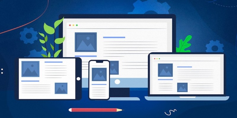
There’s no fixed screen anymore. What was designed for desktops now needs to work across tablets, phones, and other devices. Whether checking data during a commute or editing a document from the couch, the expectation is clear—the tool should just work smoothly. Responsive design is essential for this flexibility.
Online tools must adapt to any device, not just by resizing text or moving menus but by ensuring performance and usability. Responsive design isn’t an optional feature; it’s a necessity to avoid user frustration. Tools without flexibility feel broken, and users won’t wait—they’ll simply leave. That’s why responsive design is so crucial.
Beyond Layout: Making Tools Work on Every Screen
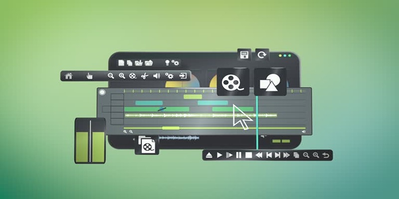
It’s easy to assume that responsive design is just about visual changes. Shrink the screen, move things around, and you're done. But online tools are more than just web pages. They're often complex systems that handle tasks like scheduling, editing, or collaborating. Making them responsive means changing how they function—not just how they look.
Let's take an online document editor. On a laptop, you might see the full set of tools—menus, options, formatting bars, and collaboration indicators. On the phone, there’s no space for all that. The design has to simplify, rearrange, and sometimes hide features without hurting the core function. That’s the real challenge.
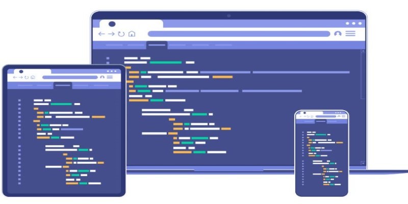
Responsive design in online tools means rethinking what users need in different contexts. Mobile use often means one-handed operation and limited attention. So, the tool needs larger tap targets, a stripped-down interface, and faster load times. On desktops, the same tool should support complex inputs, keyboard shortcuts, and maybe even multiple panels.
These shifts aren’t cosmetic. They require design and development choices that prioritize the task over the layout. That’s why building truly flexible tools involves not only design thinking but deep user understanding. What works beautifully on a wide screen can feel overwhelming—or invisible—on a phone if not handled right.
Even performance must be adapted. If a tool uses large visuals or animations on a desktop, those might become burdensome on mobile. Designers often swap them out or remove them entirely. It's all about making the tool efficient, no matter where it runs.
What Happens Behind the Scenes?
A responsive online tool works well because many decisions were made behind the scenes. There's no one-size-fits-all solution. Developers often build using flexible grids, scalable components, and carefully selected breakpoints. These help content reshape itself depending on the user’s screen size.
A flexible grid means layout sections are defined in percentages rather than pixels. So, the same tool fits a small phone screen and a wide monitor, maintaining usability. Images, too, must adjust. Large images on desktops need to be swapped for compressed versions on mobile phones to save bandwidth and time.
Breakpoints—those screen widths where a layout changes—are crucial. At certain points, a three-column layout might drop to one column, or a menu might collapse into a compact icon. Each of these choices aims to reduce friction and make interaction feel native to the screen.
There’s also an element of prediction. Developers have to imagine how users behave across different devices. A mobile user may only have a few seconds or a thumb to work with, while a desktop user might want more detailed control and visuals. Building for both ends of the spectrum means crafting flexible design at every level.
Responsive design isn’t just about appearance. It shapes the entire experience of using an online tool. It’s about making everything—from navigation to feedback—feel intuitive, regardless of screen size. When done right, users don’t even notice it. They just use the tool and move on.
Why It’s a Must in Today’s Online Experience?
People are quick to abandon clunky tools. If it doesn’t work right on the screen they’re using, they’ll find something else. In a digital world packed with alternatives, the smallest glitch or delay can cost a product its users.

That’s why responsive design in online tools is more than a best practice—it's a survival strategy. Users expect smooth, adaptive performance. They want tools that look good and function right, no matter what device they use. If an online platform can't keep up, users won't wait around.
Mobile-first design, once a buzzword, is now a default approach. Many developers design for mobile first, then expand the interface for desktops. This helps strip the product down to its essentials and focus on what really matters. Simpler interfaces usually translate into better performance and cleaner workflows.
There’s also a trust element. Tools that function consistently across platforms create confidence. They feel stable and well-made. That kind of reliability builds user loyalty over time. And in practical terms, it reduces customer complaints, support requests, and lost engagement.
Responsive tools also tend to be more sustainable. They load faster, consume fewer resources, and are easier to maintain. Updates affect all versions of the interface equally, so developers don’t have to patch multiple versions. It’s efficient—for everyone.
From an accessibility standpoint, flexible design also makes tools more usable for people with different needs. Better navigation, text scaling, and layout adjustments can all improve accessibility without requiring a separate version of the product. That’s another point in favor of going responsive—not just for functionality, but for inclusivity.
Conclusion
Responsive design in online tools isn’t a luxury—it’s a necessity. As users move between phones, tablets, and desktops, they expect tools to adapt without friction. A well-designed, responsive interface feels natural and seamless, no matter the screen. It boosts performance, improves usability, and builds trust through consistent functionality. In a world full of digital choices, users won’t settle for tools that feel clunky or limited. They’ll move on. That’s why flexible design must be baked into every decision, not added on later. In short, responsiveness isn’t just about looking good—it’s about staying relevant, reliable, and truly user-centered.
Advertisement
Related Articles

How to Use Feathery for Better No-Code Forms and Workflows: A Complete Guide
HubSpot vs. Marketo: Features, Benefits, and Drawbacks Explored

Docusign vs. HelloSign (Now Dropbox Sign): Which is Best for Your Business

The Best Calendar Apps for Windows in 2025: Stay Organized and On Track
Building Flexible Online Tools: The Power of Responsive Design

Top 6 Electronic Signature Apps in 2025 to Sign Documents with Ease

The 9 Best Asana Alternatives in 2025 to Plan, Track, and Deliver Smarter

Beyond QuickBooks: 10 Fresh Alternatives to Elevate Your Accounting Game in 2025

The 10 Best Campaign Management Software Tools in 2025 for Effortless Marketing Success
Top Trello Alternatives to Try in 2025 for Better Project Management

The 8 Best Email Apps for iPhone in 2025 to Keep You on Top of Things